
In the bustling business landscape of Calgary, standing out from the crowd is more important than ever. One of the most effective ways to grab attention and draw customers to your business is through well-designed signage. An eye-catching sign not only serves as a beacon to potential customers but also communicates your brand’s identity and values. At Fluorescent Man Lighting Calgary, we understand the power of great signage and are here to help you make your business shine. In this blog, we’ll share three essential tips for designing business signs that are not only visually appealing but also effective in conveying your message.
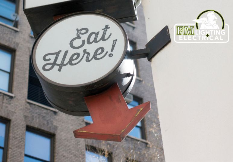
When it comes to signage, less is often more. The primary goal of your business sign is to communicate a message quickly and effectively. A cluttered or overly complicated design can confuse potential customers and obscure your key message. Here are a few guidelines to keep in mind:
Focus on the Essentials: Include only the most important information, such as your business name, logo, and a brief tagline or description. Avoid overcrowding the sign with too much text or unnecessary details.
Choose Readable Fonts: Select fonts that are easy to read from a distance. Sans-serif fonts are generally more legible than serif fonts. Ensure that the font size is large enough to be seen clearly from the street or sidewalk.
Use High-Contrast Colors: High-contrast color combinations, such as black and white or dark blue and yellow, enhance readability. Ensure there is a stark contrast between the text and the background to make the sign stand out, even in low-light conditions.
Include White Space: Don’t be afraid of empty space. White space (or negative space) helps to draw attention to the important elements of your sign and prevents it from looking cluttered.
2. Reflect Your Brand Identity
Your business sign is an extension of your brand. It should reflect your company’s personality and values, helping to create a cohesive and memorable brand image. Here’s how to ensure your signage aligns with your brand:
Consistent Branding: Use colors, fonts, and imagery that are consistent with your overall branding. If your business has specific brand colors or a logo, incorporate them into your sign design to create a unified look.
Unique Design Elements: Consider what makes your business unique and try to incorporate those elements into your signage. Whether it’s a specific graphic style, a quirky logo, or a distinctive color scheme, your sign should capture the essence of your brand.
Quality Materials: The quality of your sign reflects the quality of your business. Investing in high-quality materials not only ensures durability but also conveys a sense of professionalism and reliability. Whether it’s sleek metal, rustic wood, or modern acrylic, choose materials that align with your brand’s image.
Lighting: Lighting can make a significant difference in the visibility and impact of your sign. Consider options like LED lighting, backlighting, or even neon to make your sign pop, especially during evening hours.
3. Consider Placement and Visibility
Even the most beautifully designed sign won’t be effective if it’s not easily visible to your target audience. Strategic placement and visibility are crucial to ensuring your sign captures attention. Here are some tips:
Optimal Location: Place your sign where it can be easily seen by passersby and potential customers. Consider the height, angle, and proximity to foot traffic and vehicle traffic. For storefronts, signs placed above the entrance or in windows are often most effective.
Proper Sizing: The size of your sign should be appropriate for its location. A sign that is too small may go unnoticed, while a sign that is too large can be overwhelming. Ensure the text and graphics are large enough to be read from the intended viewing distance.
Avoid Obstructions: Make sure your sign is not obstructed by trees, buildings, or other objects. Regularly check the visibility of your sign from different angles and distances to ensure it remains unobstructed.
Lighting for Visibility: As mentioned earlier, lighting is key. Ensure your sign is well-lit during all hours of operation. This can be achieved through spotlights, backlighting, or integrated LED lights, making your sign visible and attractive day and night.
Designing an eye-catching business sign involves a careful balance of simplicity, brand alignment, and strategic placement. By keeping your design clear and focused, reflecting your brand identity, and ensuring optimal visibility, you can create a sign that not only attracts attention but also effectively communicates your business message. At Fluorescent Man Lighting Calgary, we are dedicated to helping you create high-quality, impactful signage that enhances your business presence. Invest in great signage today and watch your Calgary business shine - contact us to see what we can do for you!
FAQS
Q: What are some common mistakes to avoid when designing business signs?
A: Avoid cluttered designs, using too many fonts or colors, and placing signs in obstructed locations. Ensure the sign is clear, readable, and strategically placed.
Q: How can color choices impact the effectiveness of a business sign?
A: High-contrast color combinations, such as black and white or dark blue and yellow, enhance readability and make the sign stand out, even in low-light conditions.
Q: Can Fluorescent Man Lighting help with designing and installing business signs in Calgary?
A: Yes, Fluorescent Man Lighting specializes in creating high-quality, impactful signage tailored to your business needs, ensuring your sign stands out and effectively communicates your message. Contact us to get started!
.jpg "Fluorescent to LED Upgrade Guide")

.jpg "Benefits of LED Signage Lighting – Calgary Signage Installation Services")

