
Effective signage is crucial for any business, serving as a powerful tool to attract customers, convey essential information, and reinforce brand identity. However, designing and implementing signage is not without its pitfalls. At Fluorescent Man Lighting Calgary, we have seen firsthand how common mistakes can undermine the effectiveness of even the most well-intentioned signs. In this blog, we’ll explore three common signage mistakes and provide practical tips on how to avoid them, ensuring your signage works to its fullest potential.
1. Overcrowding with Information
One of the most frequent mistakes businesses make is trying to include too much information on their signs. While it’s important to communicate your message, overwhelming potential customers with text can be counterproductive.
The Problem:
Overcrowded signs are difficult to read and understand, especially from a distance. When a sign is cluttered with excessive text, small fonts, and too many images, it becomes visually overwhelming and fails to convey a clear message. This can cause potential customers to overlook the sign entirely, missing the key information you intended to share.
The Solution:
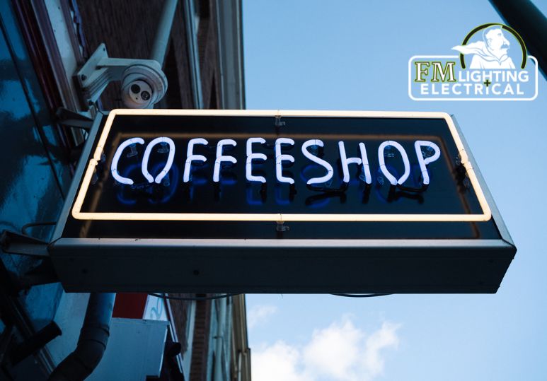
Keep It Simple: Focus on the essentials. Your sign should quickly and effectively communicate the most important information, such as your business name, logo, and a brief tagline or message. Avoid using full sentences and opt for concise, impactful wording.
Prioritize Readability: Use large, legible fonts that can be easily read from a distance. High-contrast colour combinations, such as black and white or dark blue and yellow, enhance readability. Ensure there is adequate spacing between elements to prevent a cluttered appearance.
Use Visual Hierarchy: Organize information using visual hierarchy principles. Highlight the most important elements, such as your business name and main message, by making them larger and more prominent. Secondary information, like contact details or a slogan, should be smaller and less dominant.
2. Ignoring Brand Consistency
Your signage should be an extension of your brand, but a common mistake is neglecting to align the sign's design with your overall branding.
The Problem:
Inconsistent signage can confuse customers and dilute your brand identity. If your signage uses different colours, fonts, or styles than your other marketing materials, it creates a disjointed and unprofessional image. This inconsistency can undermine the recognition and trust you’ve built with your audience.
The Solution:
Maintain Consistency: Ensure that your signage aligns with your established brand guidelines. Use your brand’s colours, fonts, and logo consistently across all your signs. This creates a cohesive look that reinforces your brand identity and helps customers immediately recognize your business.
Reflect Your Brand’s Personality: Your signage should convey the same tone and personality as the rest of your branding. Whether your brand is modern and sleek, rustic and cozy, or vibrant and playful, your signs should reflect these attributes to create a unified brand experience.
Quality Materials and Design: Invest in high-quality materials and professional design services to ensure your signs look polished and durable. High-quality signage not only looks better but also lasts longer, maintaining your brand’s image over time.
3. Poor Placement and Visibility
Even the most well-designed sign won’t be effective if it’s not placed in a location where it can be easily seen by your target audience.
The Problem:
Signs that are poorly placed, obstructed by other objects, or not adequately lit can go unnoticed. If your sign is not visible to passersby, it fails to attract attention and draw in potential customers, rendering it ineffective.
The Solution:
Strategic Placement: Consider the location carefully when installing your signage. Place signs where they will be most visible to your target audience, such as above the entrance, along busy streets, or in high-traffic areas. Ensure that the sign is at eye level or slightly above to maximize visibility.
Avoid Obstructions: Regularly check your sign’s visibility from different angles and distances to ensure it is not blocked by trees, buildings, or other structures. Trim any foliage or reposition the sign as needed to keep it clear and unobstructed.
Proper Lighting: Ensure your sign is well-lit, especially during evening hours. Use spotlights, backlighting, or integrated LED lights to make your sign visible in low-light conditions. Well-lit signs are more likely to catch the eye and convey your message effectively.
Effective signage is an essential aspect of any successful business, but common mistakes like overcrowding with information, ignoring brand consistency, and poor placement can significantly reduce its impact. By keeping your design simple and readable, maintaining brand consistency, and ensuring strategic placement and visibility, you can maximize the effectiveness of your signage. At Fluorescent Man Lighting Calgary, we are dedicated to helping businesses create high-quality, impactful signs that attract customers and reinforce their brand identity. Avoid these common pitfalls, and let your signage work for you, making a lasting impression on your audience. Call us to see how we can help with your signage needs.
FAQs
Q: What is visual hierarchy in sign design?
A: Visual hierarchy organizes information by importance, making key elements like your business name and main message larger and more prominent.
Q: How can I ensure my signage reflects my brand's personality?
A: Use your brand’s colours, fonts, and logo consistently. Reflect your brand’s tone and personality in the sign’s design to create a unified brand experience.
Q: How can Fluorescent Man Lighting Calgary help with my signage needs?
A: Fluorescent Man Lighting Calgary provides expert advice and high-quality signage solutions, helping you avoid common mistakes and create impactful signs. Call us to see how we can help!
.jpg "Fluorescent to LED Upgrade Guide")

.jpg "Exterior Commercial Lighting Safety Tips Guide – Calgary Exterior Lighting")

